client
ERG energy solutions
branding, lettering & signaling, website
brief
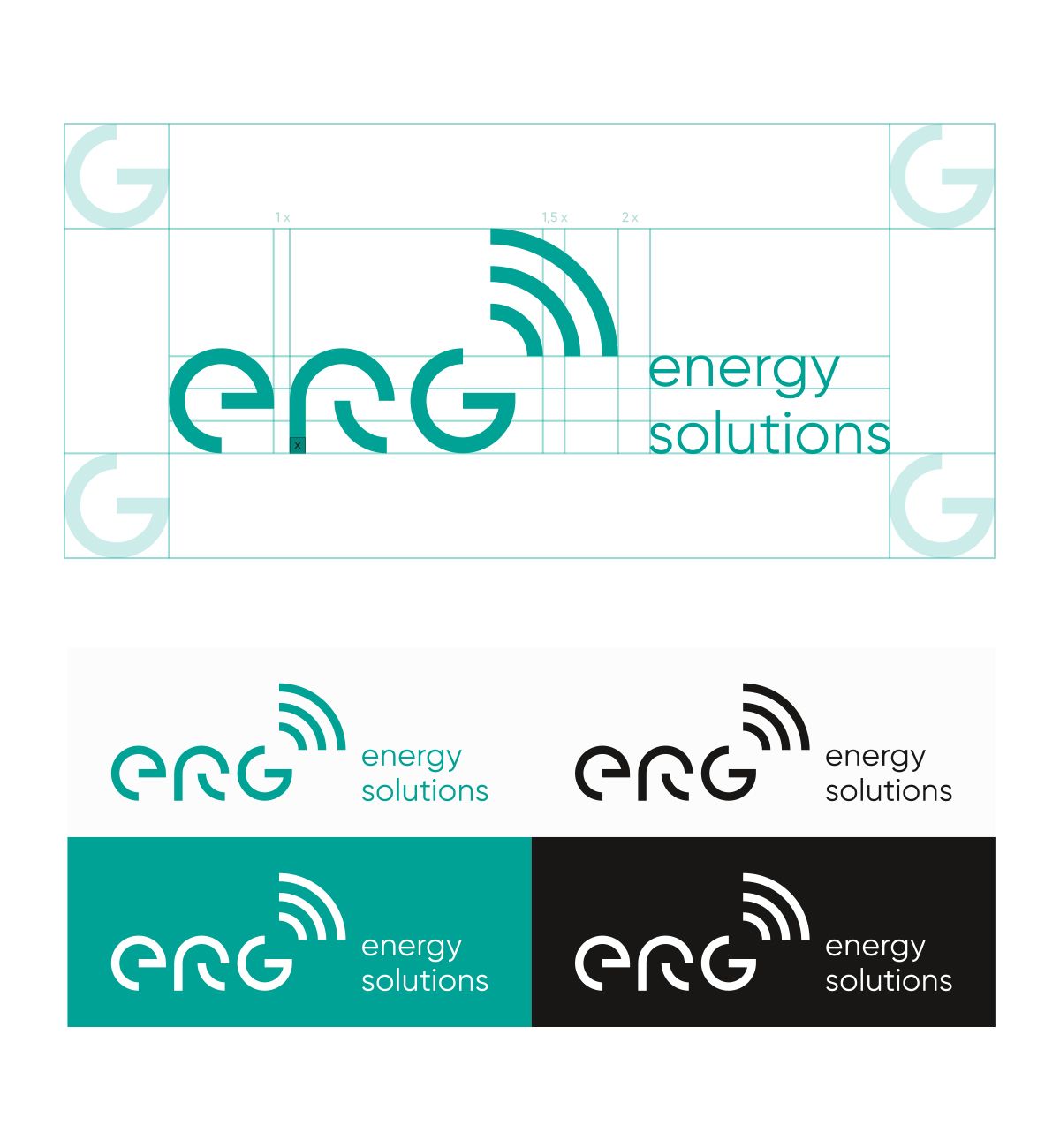
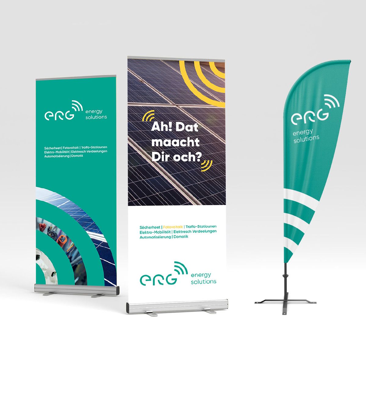
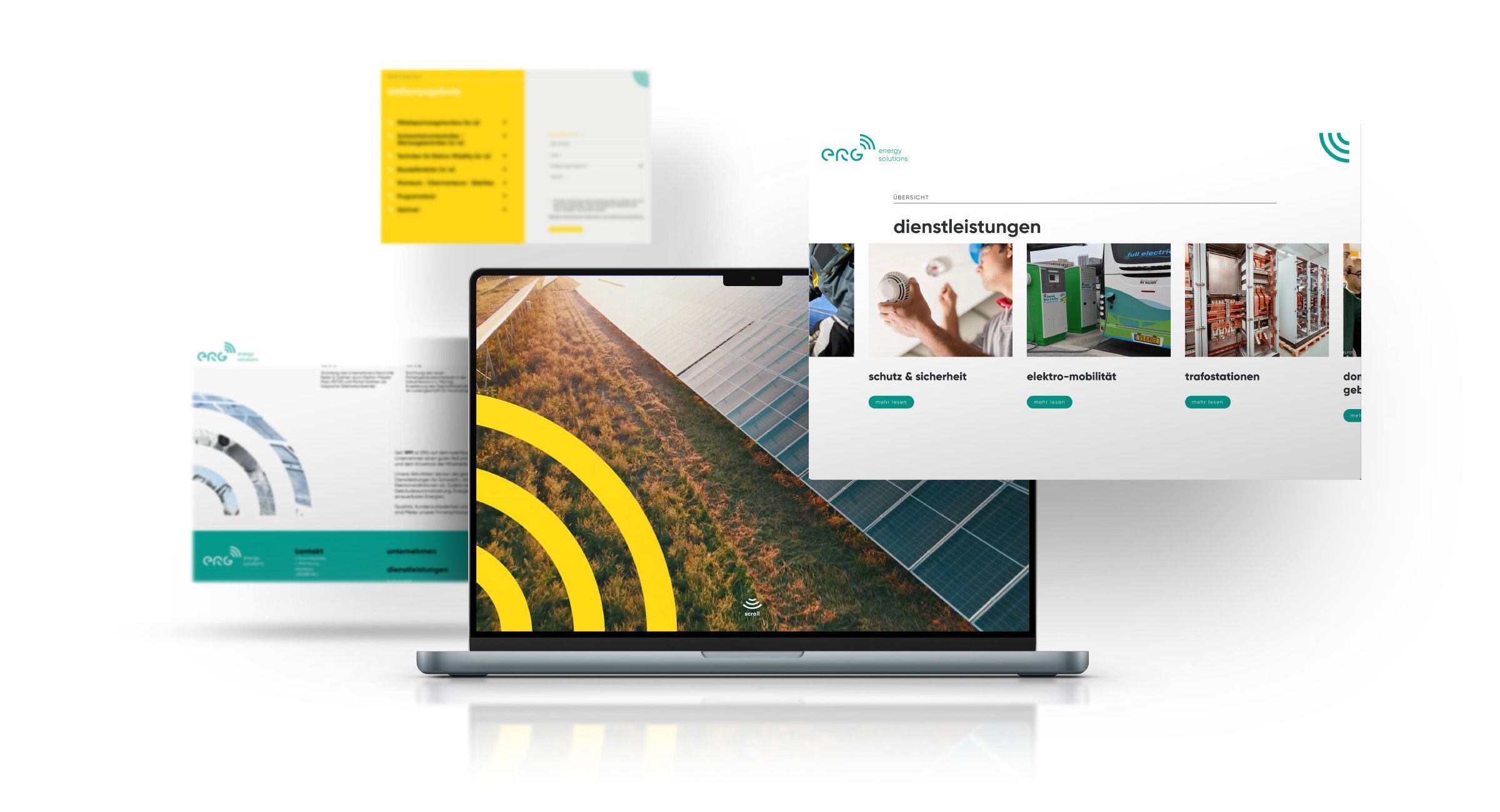
Founded in 1991 as a small electrical company, Électricité Reiter & Grethen has grown into a specialised and innovative installer. The decision to adopt a shorter name gave rise to the abbreviation “ERG”, which became the company's new symbol. Based on these three letters, a logotype was created using segments of circles, reflecting connectivity and energy solutions.
solution
