client
TR Engineering
branding, website
brief
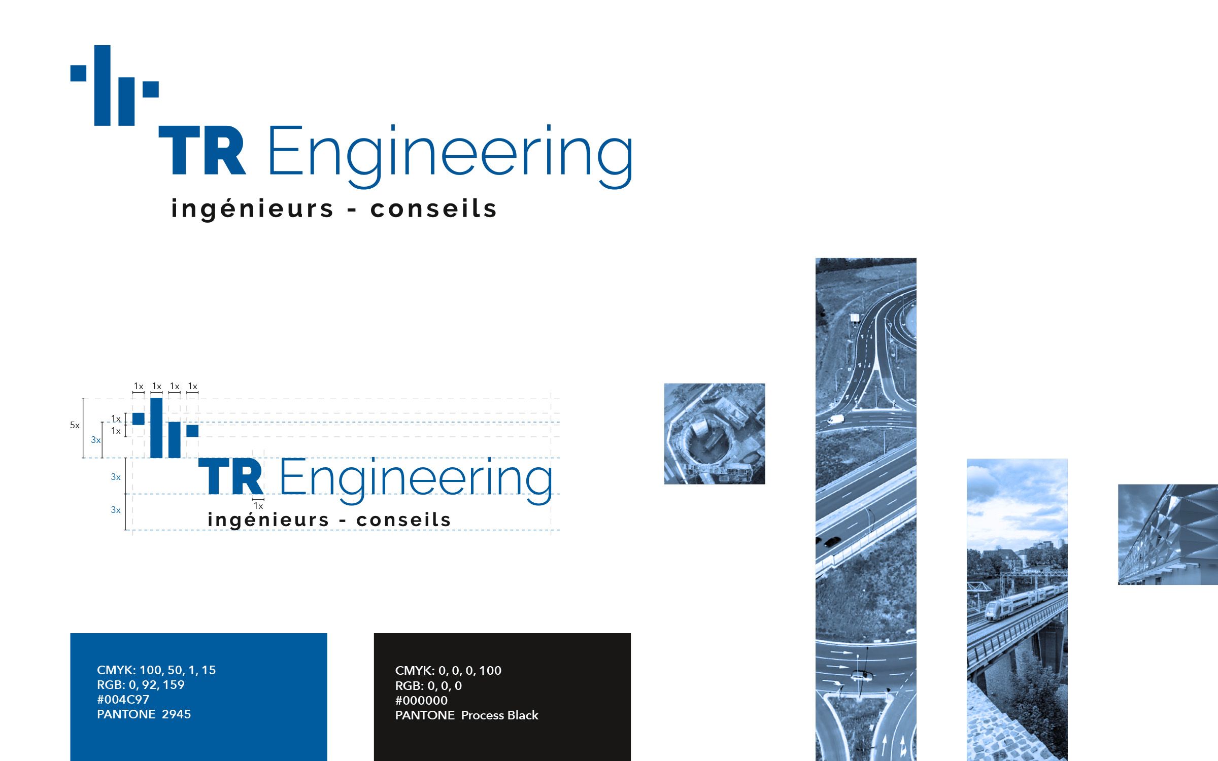
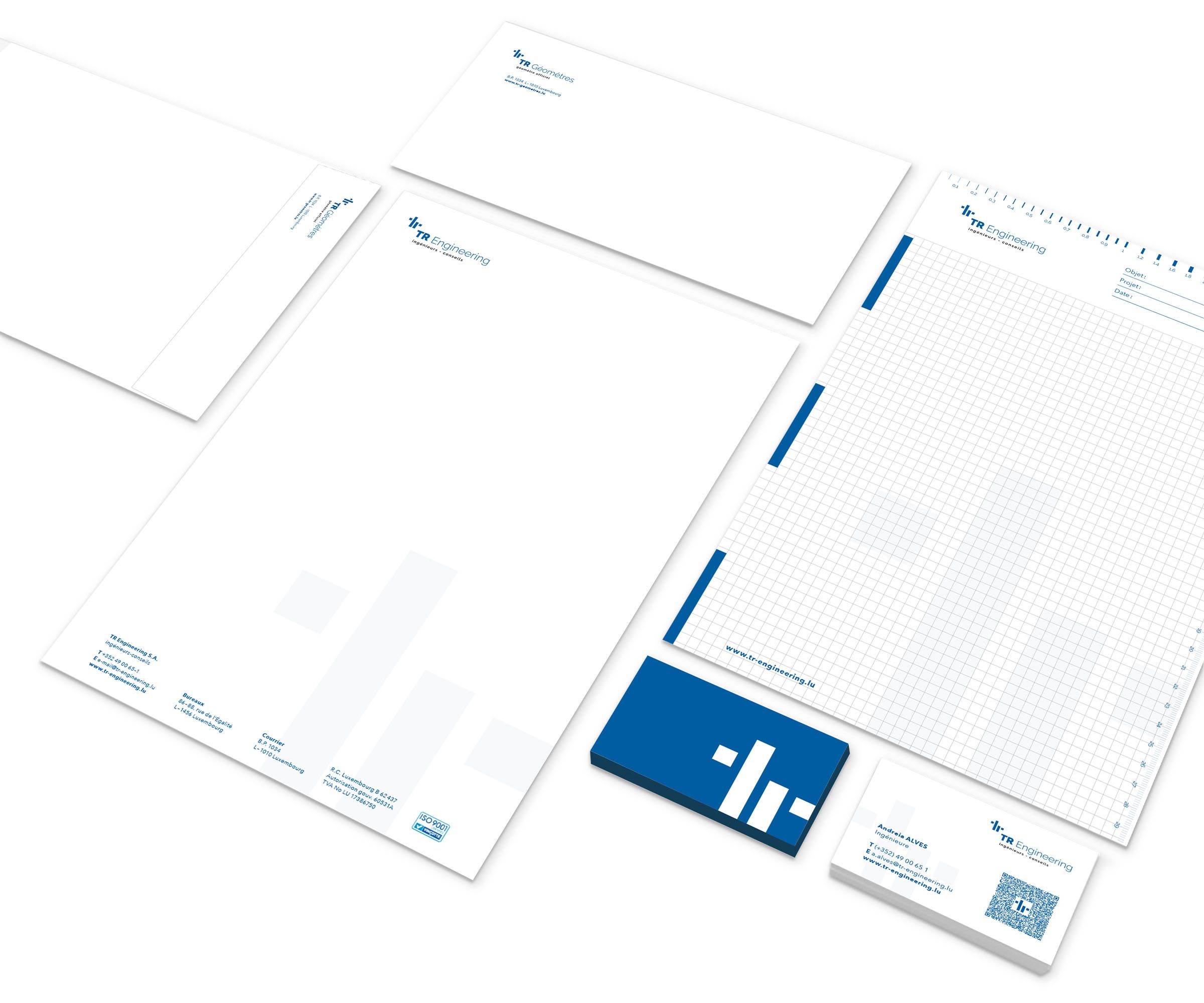
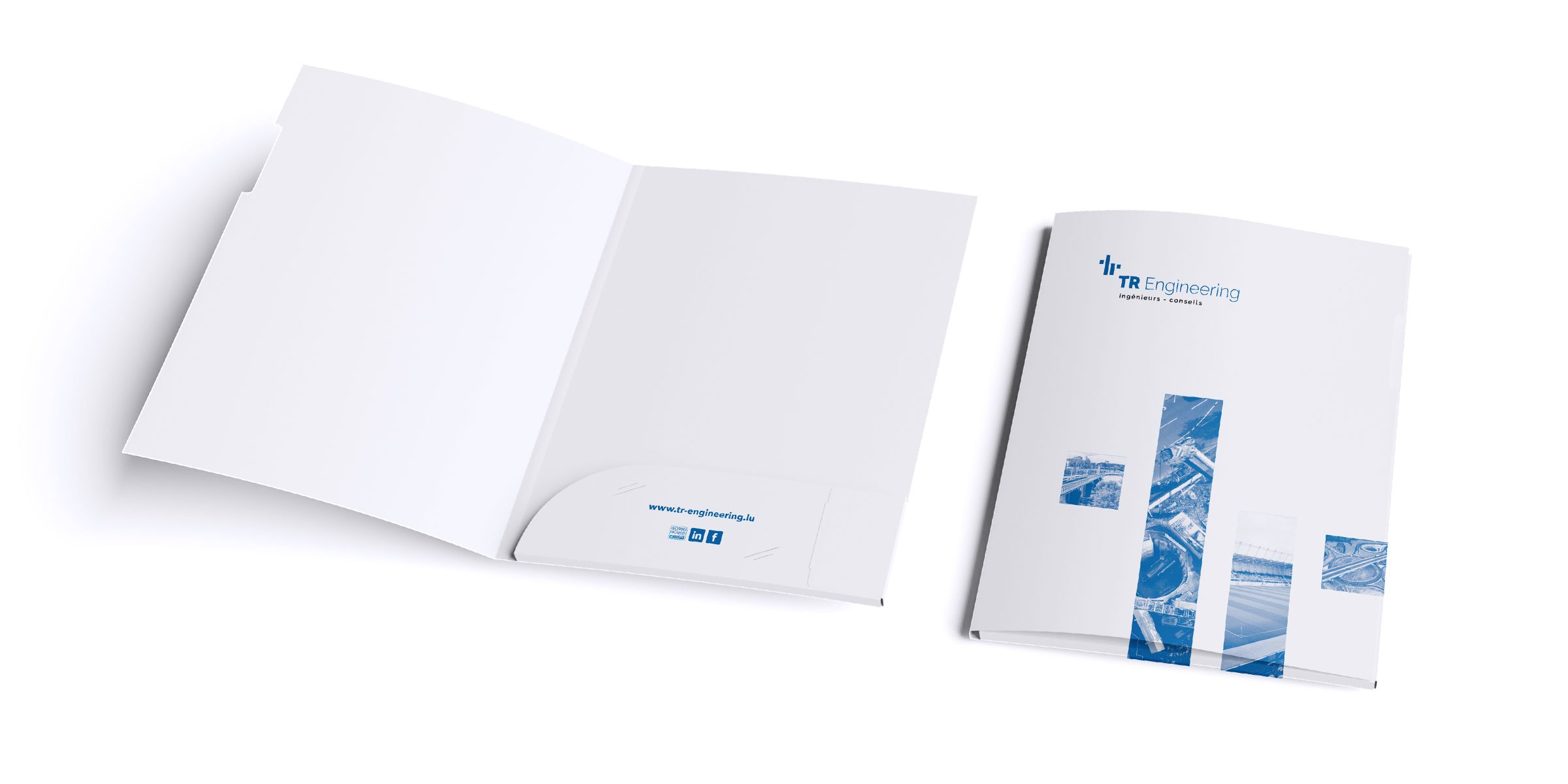
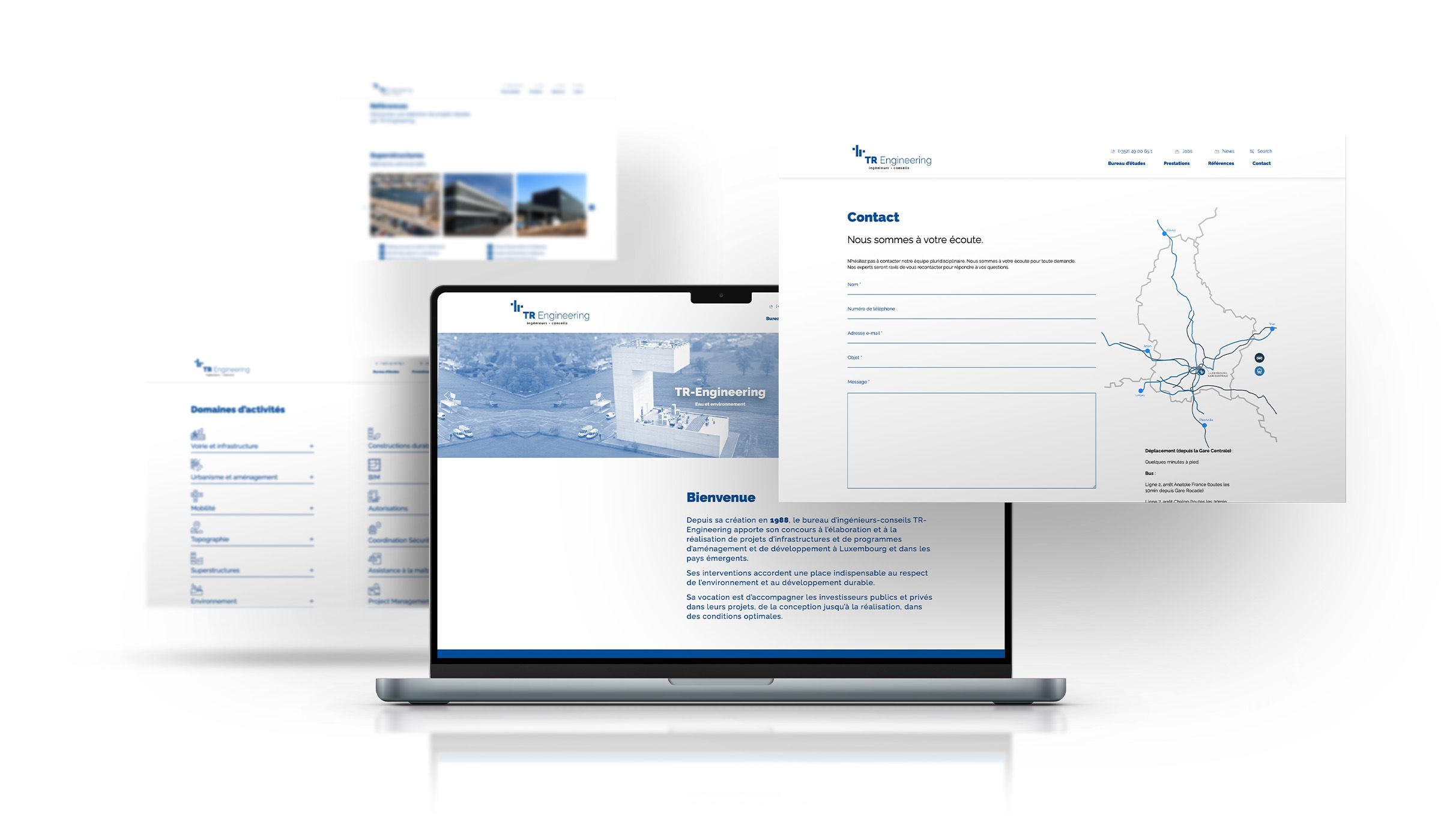
The engineering firm TR Engineering, together with its subsidiaries TR Géomètres and LuxAuTec, bases its internal and external communication on a clear, minimalist graphic language. The three logos bear the same signature and demonstrate the unity of the group of companies. The entire appearance is based on the two-tone colour scheme of black and dark blue. This colour scheme, in combination with large white areas, creates a distinctive, clean look that reflects the structured nature of engineering.
solution
